
First Impressions of Colour Separation for Textile Design course by The Print School
The Print School (TPS) offers online courses for textile and surface pattern designers. They came out with a new course today, Colour Separation for Textile Design. I bought the course for the Earliest Bird price, $127 USD. Here are my first impressions.
As a reference, I’ve purchased all The Print School courses except for The Beginners Course. Most of my course purchases were with Early Bird pricing. Some were purchased back in the day when TPS only sold their courses in AUD so the currency conversion to USD made it somewhat less expensive.
The price for this course was lower than most of their other courses, so I wasn’t sure what to expect. TPS did some initial social marketing promo to hype the course, but there wasn’t much information about what the course would include, its size etc.
This is a short course
After purchasing the course at 6:59AM I earned the completion certificate at 8:12AM. I watched all the videos at regular speed. A couple times I paused and rewatched parts a second time. Module 1 is about 3 and a half minutes total. It contains a welcome, a broad mention of screens and cost, and a quick reminder of the importance of communicating realistic expectations with your client. Module 2 is about 56 and a half minutes. It contains all the technical Photoshop demonstrations and a short look at designs that are not appropriate for color separation. There are two short multiple choice tests, one of which earns you a completion certificate.
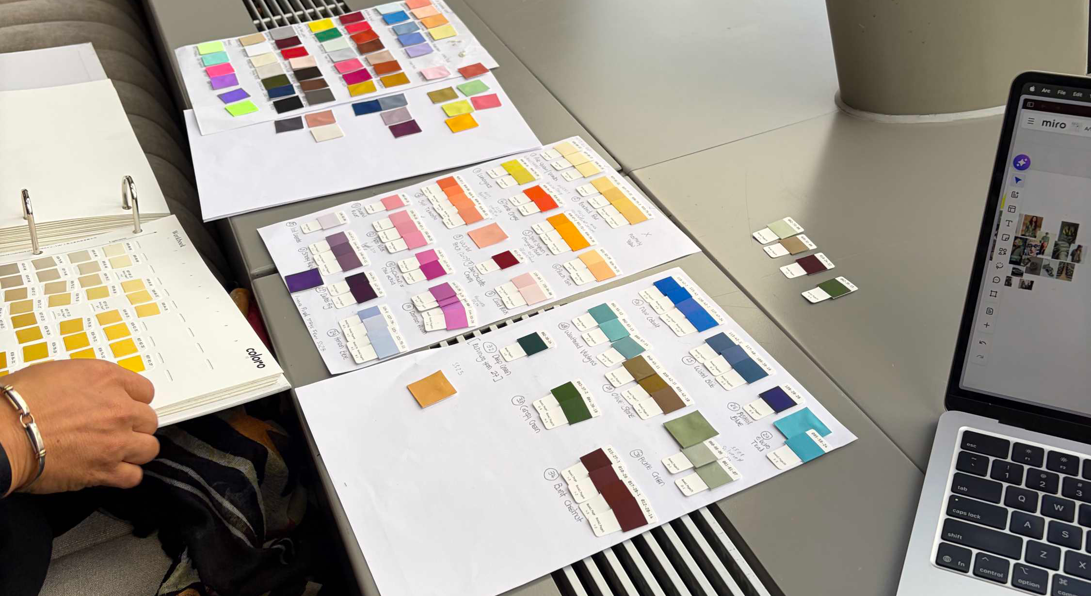
image source: wgsn
It’s not too technical.
A short course isn’t bad, per se. It depends on the quality of content. The topic of color separation can get really technical, nerdy and “in the weeds” quickly. An example, I once took an 18 week course on Color Indexing that would make an average designer’s eyes bleed by the end. So in a way, I appreciate the brevity of this course. But it might be too quick and brief for some who are less experienced with Photoshop and color separating. Or, it’s only scratching the surface and might be redundant for more experienced designers.
The TPS says the techniques shown in the course are not intended to replace actual print-ready production from the printer. So you won’t see screen cleaning, knocking out etc. The color separation techniques taught are meant to be useful for designers and clients who want to easily work on colorway options before sending it off to the printer. And the Printer is far more capable of creating the best color separation for printing.
This isn’t a course on Indexing.
The indexing mode is used (very basically) as one step to facilitate one of their separating techniques. It’s not used on its own to complete a color separation.
The editing and sound quality is fine. This course doesn’t include background music. The Photoshop demos are a basic screen recording. You’ll want to watch these on a large screen, not a tablet, because there isn’t extra editing to zoom in to show what’s happening with tools and panels in Photoshop. The speed is quick so pause and replay as needed. TPS is also pretty good at answering questions posted in their community forum. Chances are good that if you have a question so do others. They will appreciate you’ve asked.
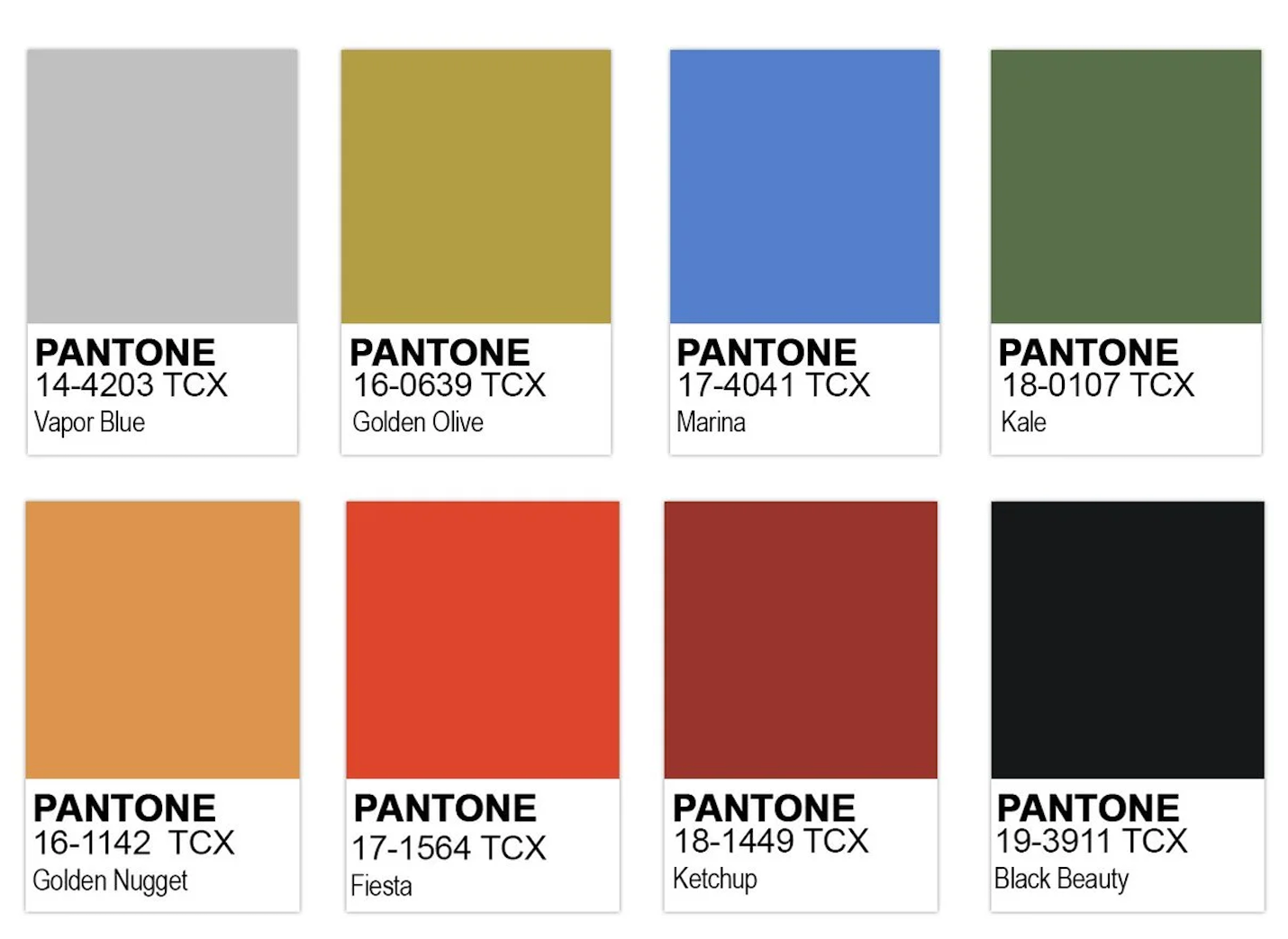
The course does not talk about about specifying color, such as Pantone or Coloro.
Maybe you already have this information?
Those who have already purchased the TPS course Photoshop for Fabric Design: Watercolor (unfortunately no longer available to purchase) will have learned the majority of the information in this new course. See Chapter 6: Color Separating Your Design. However, there is one extra technique that hasn’t been shown in the other TPS courses, bitmapping separations. I was so happy to see their process for this!
Those who have already purchased the TPS course Gouache Roses for Fabric: Drawing to Digital Design has a good amount of the technique learned (see Chapter 2 Part 2: Screen Printable), but there is more to learn from this new course if you want to separate watercolor painting.
Overall, I think it’s a good course but lacking in some areas.
I would have liked more anecdotes from TPS about dealing with clients requesting color separation. More examples of how to assess and talk about a design’s potential to be color separated. Tips for estimating pricing for this kind of work. Pricing ranges for color separating work. It would have been a great opportunity for The Print School to share more of their 30+ years of experience. It falls flat to only say “price for this work.” These things and more will hopefully be discussed in their community forums.
Was this course worth the cost for me? Barely. I am happy to see the bitmap technique so I’m not regretting the purchase.
Have you taken this course? I would love to know your thoughts about it.